
Imagine this: You’re nearing the end of a major initiative you led; one aimed at boosting company performance. After months of dedicated effort from you and your team, you’re eager to see the results and understand the impact you’ve made. But when you open the summary report, you’re greeted with a dashboard full of numbers, bar charts, and complex graphs. You scan through the pages trying to make sense of it all. It feels like watching a movie without a plot—plenty of scenes, but no clear storyline to connect them all. Without a narrative, it’s hard to grasp the real story behind the numbers. Now, you’re left with a crucial question: How do you turn your data into something your audience cares about?
In today’s data-driven world, simply having the numbers isn’t enough. The magic happens when you transform raw data into actionable insights that resonate with your organization. How? Through storytelling, simplification, and clear orientation. Let’s explore these strategies and how you can leverage them.
Why Storytelling Matters
Storytelling isn’t just for fairy tales—it’s scientifically proven to enhance communication. According to Stanford research, stories are up to 22 times more memorable than plain facts. This is because stories activate multiple brain regions, fostering emotional connections and better retention.
Tip for data storytelling: Think of your data as characters in a plot. Each dataset represents a “hero” or “challenge” on a journey. For example, if team performance dropped, narrate the cause as an obstacle the team can overcome together.
Instead of saying, “Team productivity has dropped by 15%, due to communication bottlenecks and unclear priorities.” You could say “Imagine our team trying to navigate a busy intersection without clear traffic signals – everyone is slowing down, waiting for direction. By streamlining communication channels and redefining key priorities, we can remove these roadblocks and get operations flowing smoothly again.”
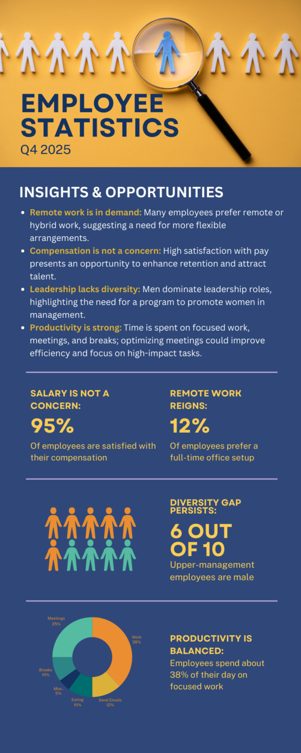
An example of how you can simplify complex workplace data, highlight key metrics, tell a story through connected data, and provide actionable insights, like gender imbalance and time allocation challenges
Simplicity: Making Data Digestible
Albert Einstein is credited with saying, “If you can’t explain it simply, you don’t understand it well enough.” Simplifying your insights doesn’t mean dumbing them down; it means distilling complexity into core messages everyone can grasp. So, if you can explain your data in a simple and clear headline, you’ve won.
Tip for data simplicity: Use “The Tweet Test.” If you can convey your key insights in 280 characters or less, it’ll be clear and concise for your stakeholders. Oversimplify first, then add layers back in for your audience. This is a great way to practice generating takeaway or headline; have your team think about if they had to tweet the insight in one sentence, what would it be?
At Vantage, we specialize in transforming complex data into clear, impactful insights. We know our clients are busy and may not be data experts, so distilling their information into concise, meaningful takeaways isn’t just appreciated—it’s essential. In our annual partner reviews, we weave together diverse data—from personality assessments and critical reasoning to leadership styles—into a simple, cohesive narrative. With so much data accumulated throughout the year, we ensure our insights cut through the noise, delivering clarity and focus. By presenting complex information in a straightforward and digestible way, we empower our clients to understand their landscape with ease and confidence.
Actionable Insights: Driving Decisions from Data
When trying to influence key decision-makers, are you simply letting the data speak for itself, assuming the facts will be enough? The true value of data lies in its relevance to decision-making. To make your insights actionable, frame them around concrete steps the organization should take.
Your goal should be to ensure that every data-driven insight translates into practical recommendations and meaningful change. Effective insights don’t just address challenges—they also spotlight successes, reinforcing what’s working well and worth continuing. When done right, this process sparks valuable conversations, uncovers unexpected implications, and empowers leaders to make informed, evidence-based decisions that move the organization forward.
Tip on creating actionable insights: How to start your action plan.
Ask Three Critical Questions:
- Why does this insight matter?
- What decision does it inform?
- How does it align with our goals?
Present Scenarios: Show potential outcomes based on acting—or not acting—on the insight. This helps decision-makers see the stakes involved.
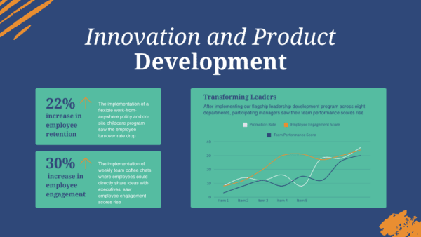
An example of how you can transform raw data into a clear narrative, using focused metrics as key highlights, and support claims with visual evidence from the performance trend graph
Visuals: Amplify Your Insights
Well-designed visuals don’t just present data—they clarify, persuade, and amplify your message. Thoughtfully crafted visuals can significantly enhance understanding and retention. In fact, studies have found that visual aids drastically improve learning (Paivio, 2014). However, cluttered or complex charts can overwhelm and confuse, undermining your message. Less is in fact more. Focus on clean, insightful graphics that emphasize the key takeaway.
Tip on displaying data visuals: Start by orienting your audience; explain what they’re looking at and why it matters. Set the stage to give context. Then, direct their attention to the most critical data point or trend—what should they care about most? Finally, provide a clear takeaway. Summarize the insight and next steps, so they leave with actionable understanding. Effective visuals don’t just show data—they create an experience that engages your audience, persuades them of your message’s importance, and inspires them to act. Remember, lead the eye, guide the mind.
At Vantage, we understand that in today’s fast-paced business world, data alone isn’t enough to drive real impact. That’s why we share these insights on data storytelling, simplicity, actionable insights, and visuals. Our goal is to empower organizations with the clarity they need to make informed, evidence-based decisions that move them forward. We specialize in developing leaders who can navigate complexity and make decisions that drive meaningful change. Let’s work together to build the leadership capabilities that will shape your organization’s future.